Communication of Scientific Research through Art
The Grade 5 students researched an artist named Jill Pelto. She is an Artist and a Scientist. To find out more about Jill Pelto see: http://www.jillpelto.com/
“Scientific research and data fuel the content of my artwork. I create pieces to raise awareness about interesting and important environmental topics.” -Jill Pelto
“Art is a uniquely articulate lens: through it I can address environmental concerns to raise awareness and inspire peopleto take action.” -Jill Pelto
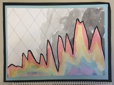
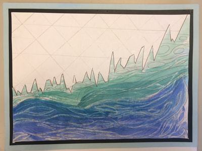
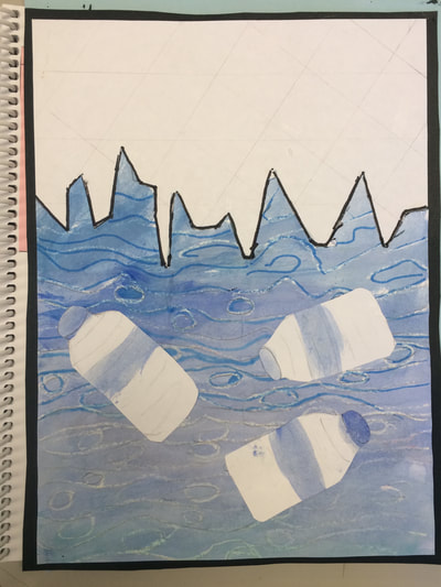
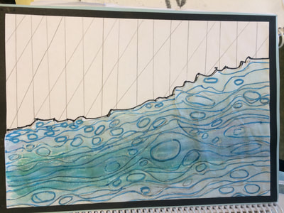
We particularly liked her Landscape of Change art because it encompassed some of our own work around water issues.
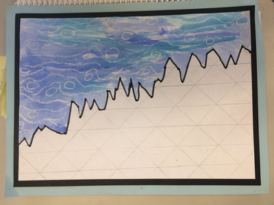
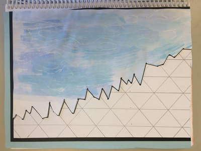
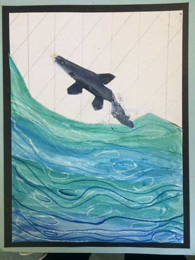
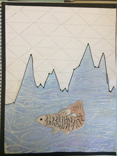
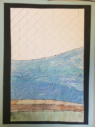
Like her, we used data graphs from scientists to create our own art. The art examples below are based on student's own studies (representing water issues as diverse as the whirling disease to lack of water impacting wildfires).
We wrote poems to go with the art. Our poems are inspired by Wallace Stevens' Thirteen Ways of Looking at a Blackbird that looks at a bird in different ways. We looked at our water issues in different perspectives.
Sample Student Writing about Their Art:
We picked this graph because it represents the Calgary, AB water level of 1915-2013! This is important to us because the flood that happened in Calgary was a disaster that affected our homes, it broke trees (which are vital to our existence), and it impacts so much life (such as animals, humans and plants).
The flood of 2013 is important to us. Citizens of Calgary that lived on the riverbanks of the Elbow and the Bow were impacted because the water came and destroyed a great deal. We know that even citizens and animals that don’t live on the riverbanks had their lives change.
Even people in our community got the rain and had part of their homes flood. We have first hand experience because this was on the news and we saw the devastating effects on citizens that either live in Calgary or around Calgary. We are sad to say that even animals lost their homes whether they live in the Calgary zoo or are wild. Animals that live or take shelter in trees lost their homes because the muddy water had such a strong current that it just ripped the trees right out of the ground taking them away. The flood was so destructive that we are still repairing parts of the city of Calgary and the prairie! At the end of our graph is the water level of 2013 (aka the flood).
By: T. and I.
Inspired by Jill Pelto
Reference for graph:
http://www.calgary.ca/UEP/Water/Pages/Flood-Info/Types-of-flooding-in-Calgary/Calgary-river-flows-historical-data.aspx
Artist Study of Nathalie Miebach
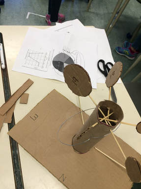
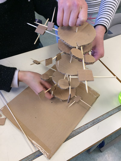
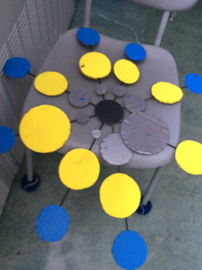
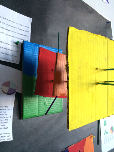
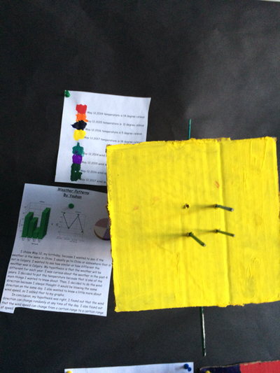
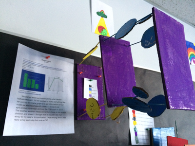
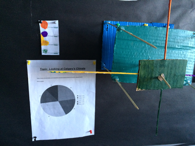
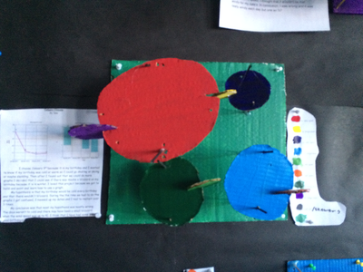
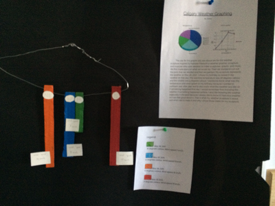
Nathalie Miebach is an artist who designs sculptures using weather data that represent certain weather events that can also be translated to music.
“My work focuses on the intersection of art and science and the visual articulation of scientific observations.” says Nathalie. (from http://nathaliemiebach.com/ )
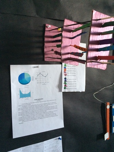
She records weather data. To create her art she uses very simple materials of everyday life such as paper, reeds, and dowels. Her technique is based on basket weaving.
“My method of translation is principally that of weaving – in particular basket weaving – as it provides me with a simple yet highly effective grid through which to interpret data in three-dimensional space” stated Nathalie.
One student in our class interpreted her work: "Nathalie has many types of building categories such as 'The little one', 'The partly sunnies', and many more which include sculptures hung up on walls, ceiling and free standing structures. She never uses words in her work, but she may use numbers and little tags to show data information".
For more information on Nathalie Miebach and her artwork, visit:
http://nathaliemiebach.com/index.html
Building Criteria
"When we first started this building project, even before we started planning, we first altogether watched a video (https://www.ted.com/talks/nathalie_miebach). This was Nathalie Miebach’s explanation on her work and on what she does. We looked at her work, which has many designs that reflect upon weather events."
After students were shown some of her work, they were inspired to make their own.
One of the students stated that Nathalie’s art is "so complex, yet she uses very simple materials". We came up with the plan to build a free standing or hanging structure with limited materials:
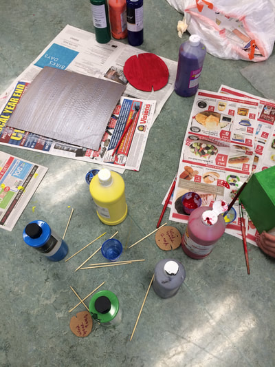
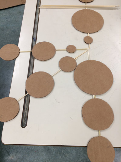
Materials that we used were cardboard, skewers, scissors, and wire (hot glue guns for special purposes).
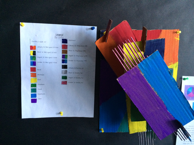
The students developed the criteria that "The structures also couldn’t be really big". Another student also said that "Nathalie uses bright colours".
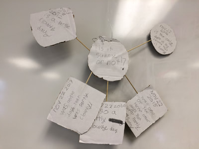
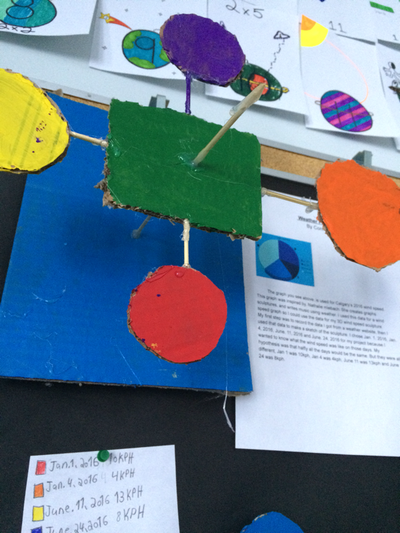
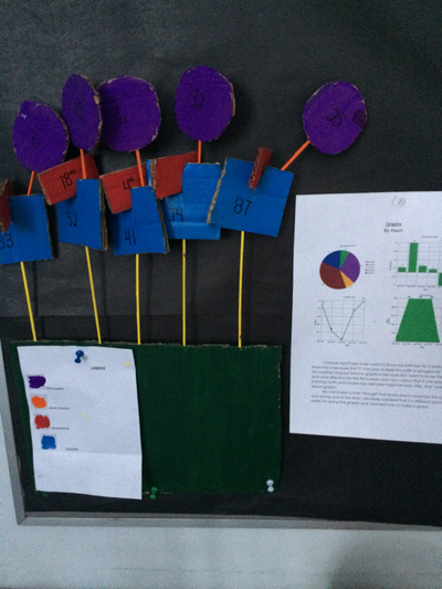
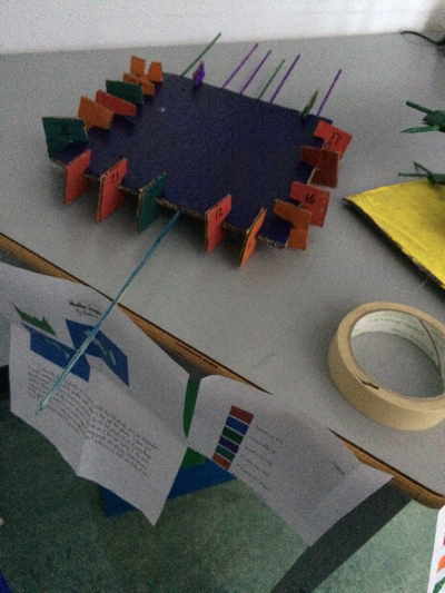
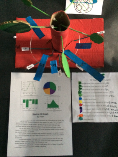
"We also have to make a legend, which tells us what the colours on our sculpture represents, like the colour blue represents humidity. The colours on the legend should also make sense, so it is understandable. Our sculptures should be neat and tidy, so it can be easily read".
We collected data on Calgary weather to represent.
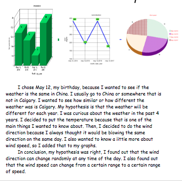
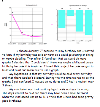
"Our models definitely should represent weather information in Calgary, on any dates. Our sculptures as well as a graph, but it doesn’t look like a graph, so it can spark our creativity. Finally, we have graphs that gives us the weather information, like humidity on a certain day is 53% or temperature on a certain day can be -26".
"Similar to Nathalie Miebach’s art, our art represented information we were interesting in find out more about and representing in a creative way".
Graphing
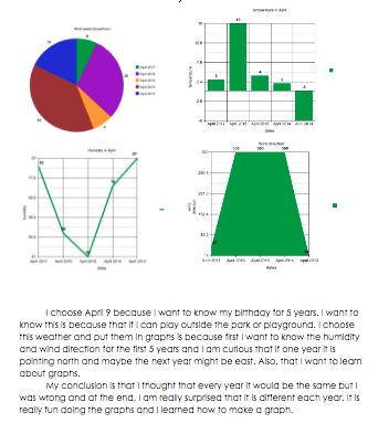
After building criteria, we started to collect weather information, than we put them on graphs. We first learned about the graphs when we were doing our weather research.
The website that we used to help make graphs was https://nces.ed.gov/nceskids/createagraph/
On the graphs, students could put as many days as we like. Students could use data they had collected or data they found and sourced. We recorded our data on the graphs, and we could have more than 1 graph. Our graph would represent either celsius, barometric pressure, humidity, wind speed, and wind direction. We could only insert numbers on the graphs, so for wind direction, kids had to use a wind direction compass to help them.
"Making the graph was also fun because you could change the backgrounds, and decorate". Under all of our graphs, we described why we chose the weather type, why we chose the date, and our research process".
Planning
After we finished making our graphs, we started planning and drawing out how our sculpture would look. The sculpture had clearly represent the graph. There were many very interesting ideas, like a student decided to make 2 spirals, and the higher the spiral is, the warmer it is.
Resources:
https://www.theatlantic.com/entertainment/archive/2015/05/the-rise-of-the-data-artist/392399/
https://www.theatlantic.com/entertainment/archive/2015/05/the-rise-of-the-data-artist/392399/
https://www.zometool.com/
Some math -art connection ideas:
https://www.youtube.com/watch?v=LYbmL6qWAP0&feature=youtu.be&t=4m38s
http://makingmathvisible.com/Workshops.html
Some Math-Art ideas:
https://arbitrarilyclose.com/home/
I love this idea!:
http://www.dear-data.com/theproject
